Page Contents
- 1 OVERVIEW
- 2 WHAT ARE THEY?
- 3 WHAT IS THE UTILITY OF THE FLOW/VOLUME LOOP?
- 4 WHAT IS “QUIRKY” ABOUT THE FLOW/VOLUME LOOP?
- 5 TAKING A STEP BACK: THE FUNDAMENTALS OF GRAPHING DATA AND CALCULUS
- 6 TAKING A STEP FORWARD: THE SHORTCOMINGS OF GRAPHING A RATE AGAINST A MEASUREMENT
- 7 TAKING ANOTHER STEP FORWARD: WHAT TO DO NEXT?
- 8 ARE THERE DISADVANTAGES TO THE FLOW VS. TIME GRAPH?
- 9 FURTHER READING
OVERVIEW
This page is dedicated to critically analyzing the utility of flow volume loops in modern day medicine.
WHAT ARE THEY?
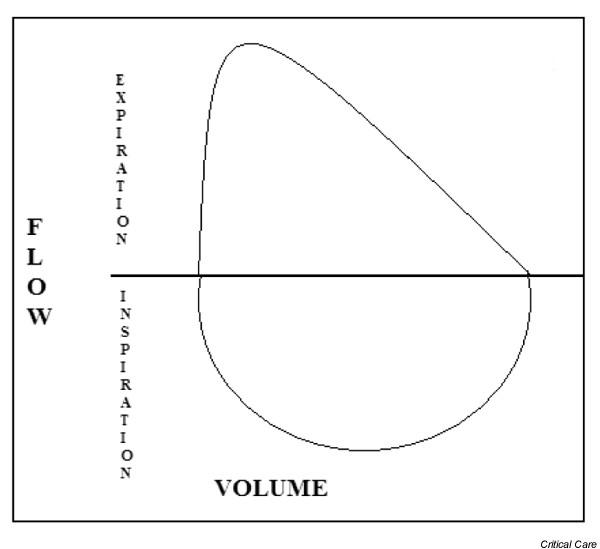
Flow volume loops are graphical representations of a patient’s pulmonary function. They are a key component of pulmonary function testing that is ordered for patients who have respiratory conditions (such as asthma or chronic obstructive pulmonary disorder/COPD). Lets take a look at the example below:
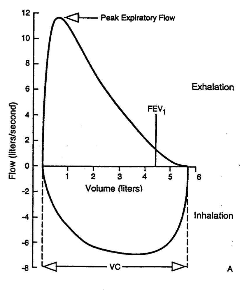
Looking at the example above, now we can start talking specifics: it is also important to keep in mind that this graph truly is a loop that is cyclic in nature (i.e. things begin at the origin of the graph, travel in the positive X/Y axis directions as the patient is exhaling, then reverse in a route back to the origin to represent inhalation).
X-axis (volume): this is measured in the liters of air that is either inspired or expired by the patient. Moving away from the origin on this axis represents exhalation and moving towards the origin on this axis represents inhalation.
Y-axis (flow): measured in liters/second, flow is a rate that characterizes how quickly a patient is inspiring/expiring air. Positive values on this axis represent flow out of the lungs (expiration), while negative values on this axis represent flow into the lungs (inspiration).
Peak expiratory flow: this point of the graph marks the maximum on the Y axis. This represents the maximum rate of exhalation that can be achieved by the patient.
FEV1: this stands for “Forced expiratory volume in 1 second”. It is the volume of air that can be forcefully expired in 1 second.
VC: this stands for “Vital capacity” and refers to the amount of air that can be forcefully moved in or out of the lungs.
WHAT IS THE UTILITY OF THE FLOW/VOLUME LOOP?
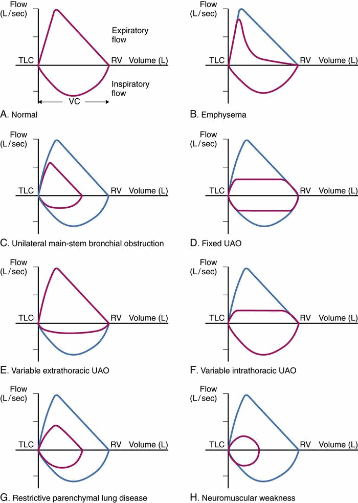
In addition to calculating the values discussed above (values like FEV1 can be used diagnostically in certain contexts), perhaps the greatest proposed strength of the flow/volume loop is the relationship between its shape and different diseases that affect the lungs.
With this in mind, the question becomes not “Are flow volume/loops useful?” but rather “Is there room for improvement in how the data of a flow/volume loop is represented? To answer this question we must evaluate what is odd about the graphical nature of a flow/volume loop.
WHAT IS “QUIRKY” ABOUT THE FLOW/VOLUME LOOP?
In light of its proposed utility, further analysis of these flow volume loops provides us with some interesting considerations. However before we even reach this discussion topic, perhaps we should review some of the basic foundational elements of representing graphical data with respect to calculus.
TAKING A STEP BACK: THE FUNDAMENTALS OF GRAPHING DATA AND CALCULUS
To put things into perspective, let us use an example from another field (physics) to characterize the traditional manner in which graphical data is represented.
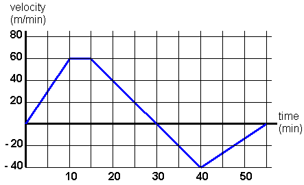
Step 1: comparing a measurement against time
Often times the most simple graphs will represent a measurement and how it changes relative to time. A great example is measuring the distance an object travels with respect to time (shown below)
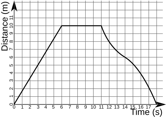
To take things to the next step, we can utilize calculus to take the derivative of this graph. This will give us the change in distance with respect to time (also known as the velocity). To tie things into our flow/volume loop, velocity is very similar conceptually to flow. Velocity is the change in distance over time, while flow is the change in volume over time.
Step 2: comparing a rate against time
Now that we have derived our distance vs. time graph, let us analyze at how the graph looks when we have a rate compared against time.
Organizing the data in this way gives us many options for analysis: depending on what we would like to figure out, we can use to major components of calculus to analyze the data form the rate vs. time graph above.
- If we take the derivative of the graph above we can calculate the acceleration (how quickly the velocity is changing)
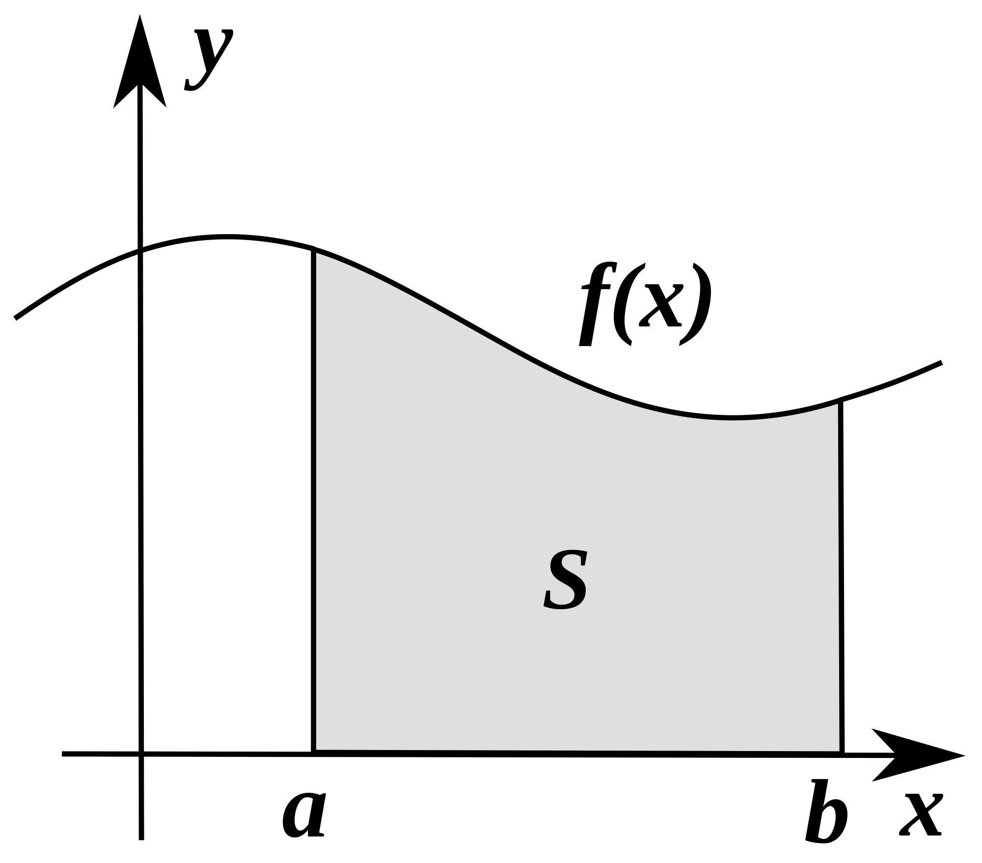
- If we integrate the graph and measure the area under the curve, we can calculate the net distance the object has traveled.
In the end, there is a reason in the field of physics organizes graphical data this way….it is very useful! What about medicine?
TAKING A STEP FORWARD: THE SHORTCOMINGS OF GRAPHING A RATE AGAINST A MEASUREMENT
Coming back to our flow volume loop we see that the major difference is that there is no axis dedicated to time alone. This begs the question….is there a drawback to this?
Let us see what happens when we try to apply the same calculus that was so beneficial in our physics example to the traditional flow/volume loop
Taking the derivative: what happens when we try and derive a flow/volume loop? In other words what does the slope of this graph represent? The answer is that it would calculate Δ Flow/ Δ Volume. In other words this would calculate the rate at which the volume is changing…as the volume is changing. Fundamentally this value has no practical utility and calling it “quirky” is putting things lightly!
Taking the integral: what happens when we try and integrate the flow/volume loop? In other words, what does the area under the curve of the graph represent? The answer is actually…nothing. Because the X axis does not represent a time measurement, it is essentially impossible to integrate this graph! If we think back to our physics example, integrating the velocity vs. time graph would yield us the distance vs. time graph. In this case….would integrating the flow vs. volume graph give us a volume vs. volume graph? I am not sure this question can be answered through basic calculus…
TAKING ANOTHER STEP FORWARD: WHAT TO DO NEXT?
While it is easy to point out the shortcomings of any model, actually proposing an improvement can be significantly more difficult. In the case of the flow/volume loops, because there is such a strong precedent for how this type of data is normally organized in the realm of physics, the solution may actually be quite simple.
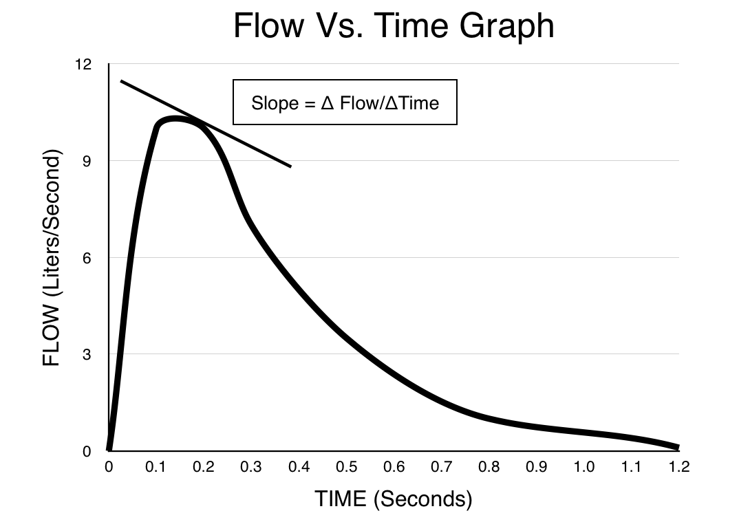
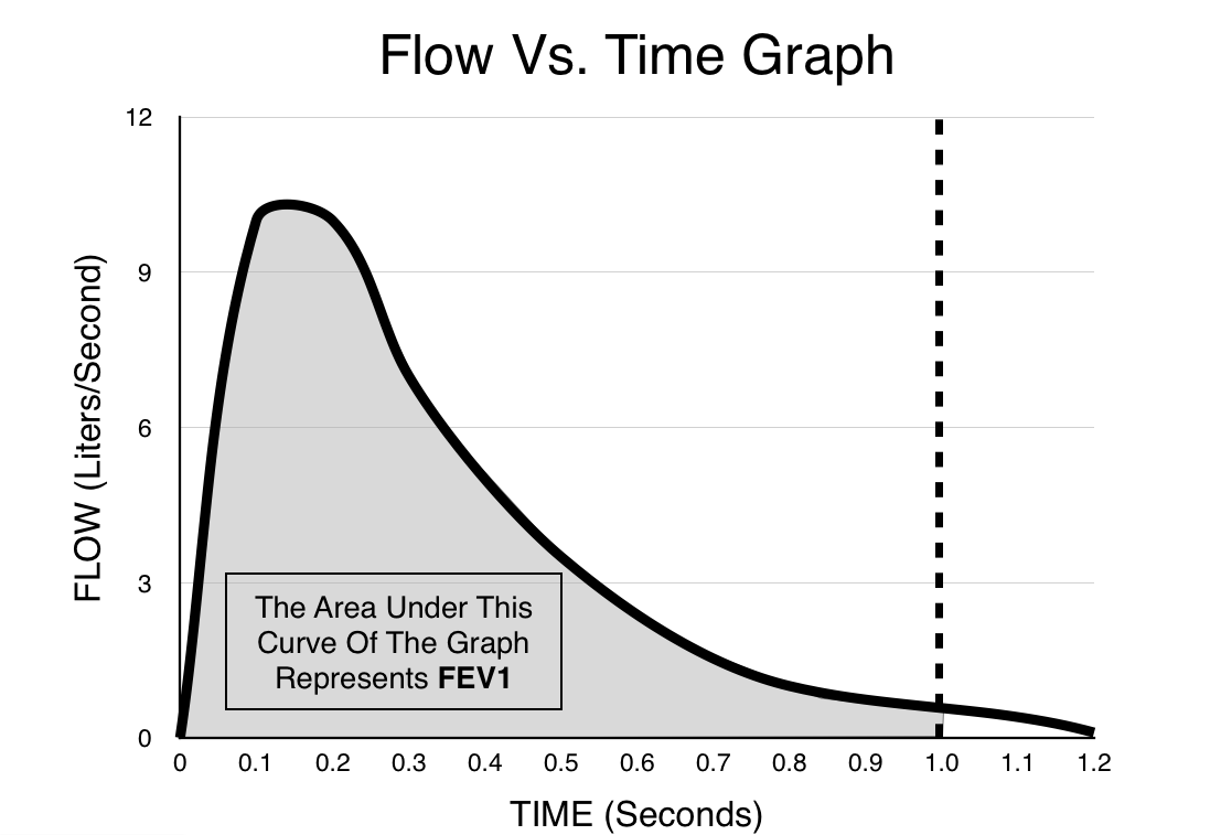
Instead of plotting flow against volume, what if we were able to plot flow against time? This would parallel exactly how data is structured in the field of physics. Lets take a look at how this would look for our newly named FLOW/TIME graph would look.
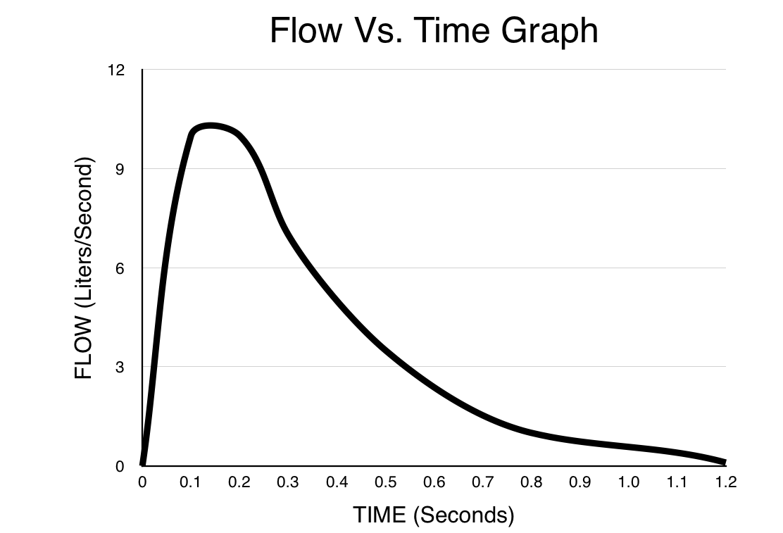
Taking the derivative: what happens when we try and derive a flow vs. time graph? In other words what does the slope of this graph represent? The answer is Δ Flow/ΔTime which is how quickly the flow is changing at a given moment. In other words, this is the rate of the flow. In the realm of clinical medicine, while this is not a terribly important mathematical calculation, it does give credibility to structuring the graph in this way (as deriving this graph gives us nonsensical information).
Taking the integral: what happens when we try and integrate the flow vs. time graph? In other words, what does the area under the curve of the graph represent? The answer in this case is net volume (can be either inspired or expired volume depending on the Y axis of the graph). In the realm of clinical medicine this feature of the graph is quite advantageous. Being able to integrate the area under this graph (with respect to time) helps us make calculations such as the FEV1 very easily, and at any given time we can clearly visualize the amount of volume that has entered/exited the lungs.
ARE THERE DISADVANTAGES TO THE FLOW VS. TIME GRAPH?
When considering this possible alternative to the flow/volume loop, we must not only consider the advantages of the alternatives, but the disadvantages as well. Let us explore a few questions here to characterize this:
Can we get the same quantitative data from the flow/time graph?
As we have demonstrated above, calculations such as the FEV1 actually are much easier and more intuitive with the flow vs. time graph. Similarly, other volume measurements (such as vital capacity) are also represented more clearly on this graph (simply integrating the entire graph will give VC).
FURTHER READING
Page Updated: 08.20.2016